Before you analyze business data:
two basics you need to know

A quick guide to data types and aggregation levels

Ever Googled “how to analyze business data” or “what does aggregation mean”? You’re not alone. Before you build a single chart or dashboard, there are two things you need to understand: What kind of data you’re working with and how detailed or summarized that data is. Ignore these, and even the most beautiful graph can lead you in the wrong direction. Get them right, and your data starts making decisions for you.

Confusing dashboards icon

How to structure your spreadsheets: data types

When you open a spreadsheet, you probably think of numbers first – revenue, profit, margins, customer counts. But numbers alone answer only how much, but not what, when, or where. That’s where categories comes in. These are the column types you'll come across:

ID card
While they’re not analyzed directly, ID columns are crucial for structure – they help you navigate, connect tables, and track individual entries.
Number icon
Numerical columns include things like revenue, margin, number of customers... They let you can calculate totals, averages, or trends.
Text icon
Categorical columns add context – what, where, and when a value was recorded. Without it, a number is just a number.

If you only have numbers, you’re staring at context-free totals. If you only have categories, you can’t do calculations. But together? That’s when your data starts telling a story.

Data types and aggregation
Intuitive dashboards icon

From numbers and text to meaningful context

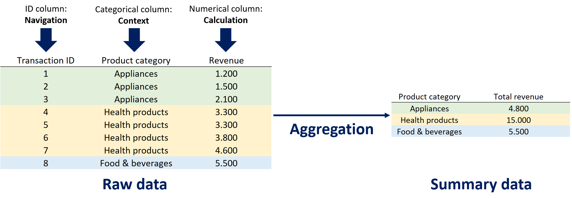
A spreadsheet on its own doesn’t tell you much – it’s just a dump of numbers and text. To get any real insight, the data needs to be aggregated into a statistical summary using functions like sum, average, or count.

But here’s the key: you must choose the right level of data granularity for the question you’re asking. If you're creating yearly plans, monthly data is useless – you’ll want yearly sales totals. But if you're looking for seasonal trends, yearly data is useless – you need quarterly or monthly breakdowns.

Pick the wrong level, and you’ll either miss the big picture or drown in noise. Good analysis is all about structuring it at the right resolution.

Decision-maker focused dashboards icon

How Power BI dashboards turn raw data into actionable insights

In Excel, every step of analysis takes time – from writing formulas to building charts and updating them when data changes. Power BI dashboards automate the process. A well-designed BI dashboard does the heavy lifting for you:

Calculator icon
It aggregates data automatically.
It lets you filter by category with ease.
Toggle icon
It offers toggles to switch between metrics like revenue, cost, or margin.
Hierarchy icon
It includes drill-downs to zoom into details without leaving the overview.


What takes ten steps in Excel takes two clicks in Power BI. If you want to go from raw data to business insight without the hassle, that’s exactly what dashboards are built for.

Request a dashboard

Check out our dashboards

Cost breakdown dashboard icon
Cost control panel

Understand your costs.
Focus your resources.

Pricing tier 1: Clarity

Break down company costs to spot hidden inefficiencies
For operations and finance staff
1 page: our simplest, most affordable dashboard
View dashboard
Performance tracking dashboard icon
Business performance tracker

Track your goals and KPIs
with a high-level overview.

Pricing tier 2: Focus

Monitor key KPIs in one place
For executives and managers
4 pages: KPI overview, trends, top products, regional performance 

(+ up to 2 optional custom pages)
View dashboard
Product insights and sales icon
Product insights dashboard

Know what sells.
Optimize what doesn't.

Pricing tier 2: Focus

Deep product insights for strategic decisions
For product teams and analysts
8 pages: KPI overview, trends, categories, profitability, product lifecycle, top performers, demand patterns, regional performance

(+ up to 2 optional custom pages)
View dashboard