
See what matters at a glance with intuitive BI dashboards for small to medium enterprises
In today’s world, information is the new gold. But for most small businesses, data lives in messy spreadsheets and half-working reports. That’s where intuitive BI dashboards come in – using interactive data visualization to cut through the clutter and show what really matters. So you can make confident decisions, fast.

Turning data into decisions is a multi-step process, and each step can distort the message. Let’s assume the data is actually clean (a big assumption). The first failure point is the analysis. If it’s too general, you lose insight. Too detailed? Might as well look at the raw spreadsheet.
The second failure point is message transfer – how the analysis is shown. This includes choices like font size, labelling, layout, and colors. Small mistakes here can cause minor misunderstandings.
The third and most dangerous is interpretation. A flashy data visualization or 3D pie chart might exaggerate a category just because it’s closer to the viewer. That’s not harmless, as it changes decisions. That’s why accurate data visualization matters more than flashy graphics.
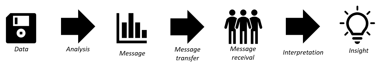
The takeaway? A good graph can be beautiful, but it must be honest. It should help decision-makers see the truth without guessing. That’s the role of effective data visualization – and why performance dashboards must focus on clarity rather than cosmetics.
Different charts have very different accuracy. While the pie chart may be popular, it’s often more misleading than a bar chart, because humans compare length more easily than angles.

It’s not just the chart type that is important. Same chart type can have wildly different efficiency in conveying data. Take a look at the example below: Same data, completely different outcome.
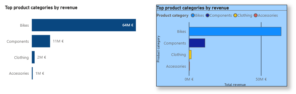
The first visualization strips away clutter. You get a clear title, straightforward labels and exact labels. It communicates instantly. The second drowns the signal in color, shadows, gradients, and redundant elements (let’s not forget to mention the horrible contrast and lack of breathing space between titles and borders which makes it hard to read).
This is the principle of the data-ink ratio – the idea that every pixel should carry useful meaning. The more visual noise is removed, the faster your audience gets to the point – that’s what makes a good business insights tool truly effective.

Now, imagine you want to see:
You’d need dozens of static charts. Or… one intuitive BI dashboard.
Interactive BI dashboards use filters, toggles, and drill-downs to collapse complexity into clean visual layers. Instead of 50 charts, there are 3 and they let the user explore what they need, when they need it. A well-designed business performance dashboard is like having a crystal ball to see your data.
Try it out: our “Growth trends” page has just 3 charts. But if you combine the filters (date, product, location), toggles (metrics), and drill-down levels, there are over 8,000 possible views hidden inside. Imagine creating 8000 graphs in Excel.
If you're a small business owner, you probably never Googled “BI dashboard.” What you actually want is faster, smarter decisions without wrestling spreadsheets or drowning in reports. But that’s exactly what business reporting tools are built for.
Our intuitive BI dashboards transform messy data into clear, interactive visuals that show you what matters, fast. With just a few clicks, you can explore performance metrics, uncover patterns, and steer your business with confidence. Every chart is fine-tuned down to the pixel to convey the maximum possible insight with minimal effort.

Understand your costs.
Focus your resources.
Pricing tier 1: Clarity

Track your goals and KPIs
with a high-level overview.
Pricing tier 2: Focus

Know what sells.
Optimize what doesn't.
Pricing tier 2: Focus