
5 easy ways to make your data readable at a glance
If you're a small business staring at a mountain of numbers in your spreadsheets, you're probably not Neo from The Matrix, able to instantly decipher what you're seeing without some kind of visual help. Luckily, there are a few simple ways to turn your data into an intuitive visual.

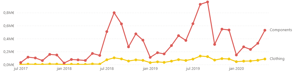
Time is your most powerful ally in business analytics. Just recording when something happened unlocks an entire layer of insight: trends. The best way to visualize this is with a line chart. Want to track how sales evolve over time? Want to compare performance across products or regions? Just plot it over time.
A couple of tips: Don’t cram in more than 5 lines. Add labels at the line ends to reduce eye-jumping between lines and legend.

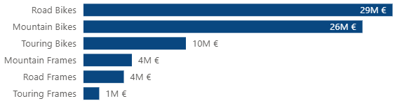
Want to see which products are crushing it and which are just coasting? A bar chart is your best friend. It's clean, direct, and perfect for ranking things by performance.
Tips: Sort bars by value or by product category – random order kills clarity. If you’re tracking multiple metrics (e.g. sales and returns), consider side-by-side bars. You can also stack the bars to show the proportions within a category.

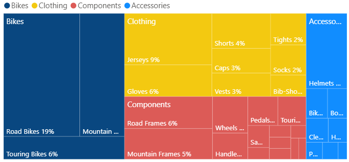
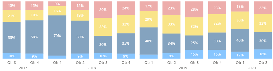
Pie charts are overrated. They may look friendly, but they make comparing slices hard, especially beyond 4 or 5 categories. A 100% stacked bar chart is cleaner, and a treemap allows even more categories with a clearer area comparison.
Bonus tip: stacked bar charts let you see changes in proportions over time much cleaner than a couple of pie charts.

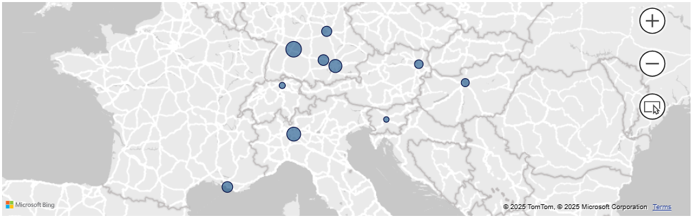
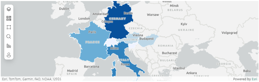
You can use bar charts to compare regions, but when geography matters, maps are far more intuitive. They can help with uncovering regional patterns.
Tips: Use a proportional symbol map (bubble sizes) for specific location-based metrics. Use a choropleth map (shaded regions) when working with area-based data like states or districts.

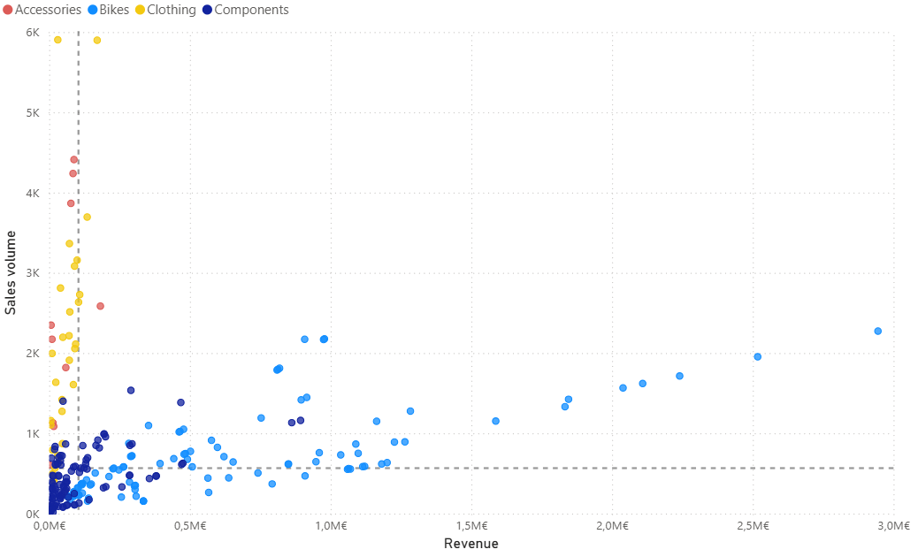
Scatter plots are underused in business, but they unlock serious insight. Want to see how profit relates to revenue? Want to find outliers or clusters? A product with huge sales but low profits might be dragging you down more than you think, and the scatter plot is the way to spot that.
Bonus tip: With interactivity, you can hover over a point to get full details. Split the graph into quadrants using median values to interpret what’s “good” or “bad” and add colors to gain another insight into patterns.

That’s exactly what we do. Our dashboards take your spreadsheets and turn them into clean, interactive visuals. All for a transparent, one-time price. You bring the data, we bring the clarity.
Understand your costs.
Focus your resources.
Pricing tier 1: Clarity

Track your goals and KPIs
with a high-level overview.
Pricing tier 2: Focus

Know what sells.
Optimize what doesn't.
Pricing tier 2: Focus