
Why small business dashboards need structure and how they use it to guide the eye
Picture this: a computer with nine screens and an analyst completely absorbed – no, lost – in all of them. Productivity? It might look like it. But what you're seeing is an illusion: more screens don’t mean more focus. In fact, multitasking is mostly a myth. Our brains aren’t built for doing multiple complex things at once. Every time we switch tasks, we pay with attention, quality, and time.
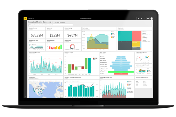
Most dashboards fall into this same trap. They look busy, complex, and important. But beneath the surface, they offer more confusion than clarity. A truly intuitive dashboard doesn't impress at first glance. It guides, tells a story. And more often than not, it does so with less, not more.

What makes a dashboard intuitive? You should know, within seconds, what the dashboard is about and what each page is trying to tell you. Now imagine a page packed edge-to-edge with charts. It looks powerful, but is it easy to read? Probably not. Your eyes will wander, your brain stall. And the insight you’re after might get lost in the clutter.
White space isn’t wasted space. It’s breathing room meant to give your eyes rest. It makes charts more digestible and helps structure the page. The more space you give to what matters, the faster users can make sense of what they’re seeing.
This supports not just usability, but also deep focus, which is a necessary precondition for the kind of analytical thinking dashboards are built for. It helps you:

What’s easier: walking a clear path with signs or constantly deciding your direction at every step? Data analysis is no different. If users constantly ask, “What should I look at next?” then the dashboard is asking them to think about the interface instead of the insight.
That’s why dashboard structure matters. There should be one theme per page, one logical flow. Here’s how it should feel:
Without structure, that conclusion would take longer to reach or not arrive at all.

Each page typically includes navigation and filters, KPI cards for headline numbers, main and supporting visuals. These elements don’t carry equal weight, and the design should reflect that. Here’s how to tell when a dashboard lacks hierarchy:
Good dashboards don’t make the user work to find meaning. They guide the eye with intention, using proven patterns and subtle design cues such as size, color and contrast, alignment and positioning, proximity, whitespace... When done well, the user doesn’t even notice. Done poorly and the user gets lost.

Every pixel on our dashboards is intentional: from the layout to the shade of a button. Not to impress, but to guide your eye and reduce cognitive load. Because good design doesn’t just look good, but helps you make better decisions, faster.
Curious what intuitive BI dashboards for small to medium enterprises look like in practice? Feel free to explore our public demos.

Understand your costs.
Focus your resources.
Pricing tier 1: Clarity

Track your goals and KPIs
with a high-level overview.
Pricing tier 2: Focus

Know what sells.
Optimize what doesn't.
Pricing tier 2: Focus