
How to turn cluttered dashboards into decision-ready insight machines
Charts aren’t about being fancy – they’re about conveying information. An efficient chart tells you everything you need to know at a glance and avoids unnecessary “ink” that distracts from the core message.
Here are 10 practical tips for cleaner, clearer, and more efficient Power BI data visualization.
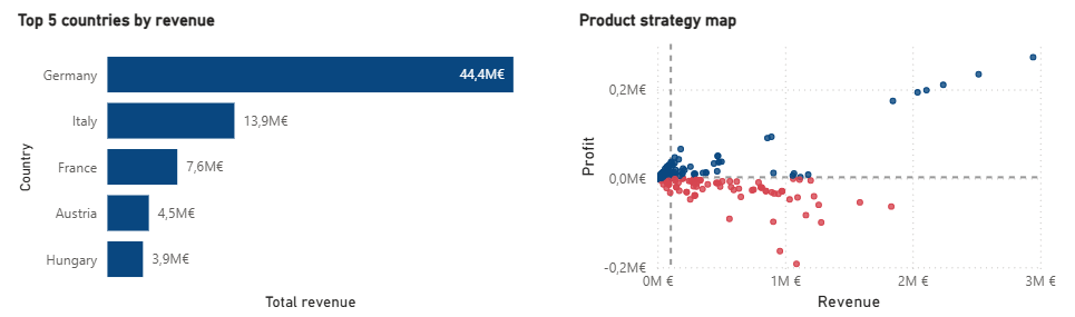
Chart titles should provide the main context. If your title is “Top countries by revenue,” it’s already clear that Germany, Italy, and France are countries and the numbers represent revenue. Only add axis titles when the chart would be unclear without them (like scatter plots) or the meaning of the values isn’t obvious from the title.
Less text means faster comprehension.
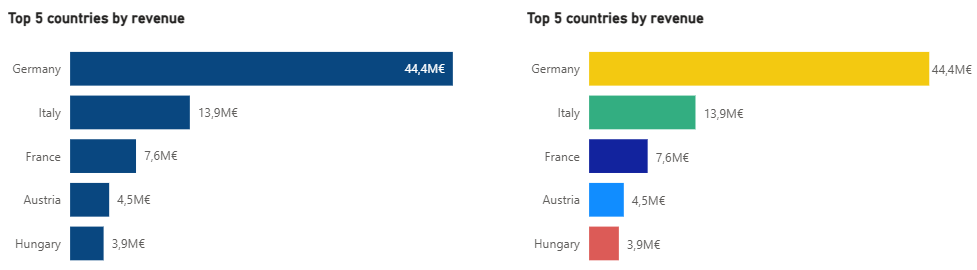
Color is powerful, but overuse leads to chaos. Use color only to differentiate categories or highlight what’s important. Keep your palette limited and consistent across visuals. Reserve bright or accent colors for insights that need attention.
Monochromatic or muted charts may feel “plain,” but they do their job without confusing the reader.
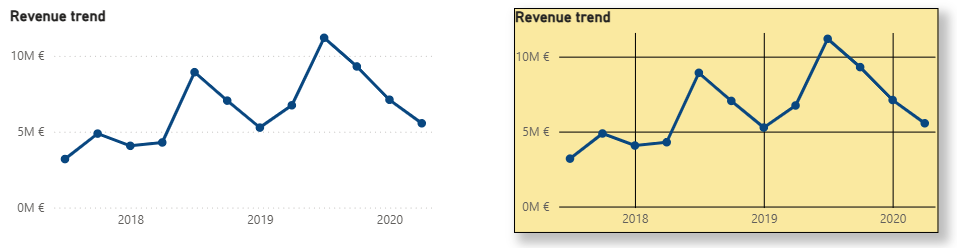
Power BI offers countless visual settings – but not all should be used. Prefer whitespace over borders to separate visuals; it’s cleaner and more pleasant. If separation is needed, subtle shadows work better than thick borders. Avoid heavy backgrounds that reduce contrast and create color conflicts. Gridlines should be minimal, especially vertical ones. Make them dotted, light, and non-distracting if you keep them at all.
Subtlety keeps the focus on the data, not the frame.
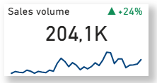
Not all data needs a graph. For single values, like total revenue or monthly growth, a KPI card is enough. A professional KPI card can show the value, a title, a growth indicator, and a small sparkline.
Clean single-value visuals save space and communicate instantly.
Data labels give precise values at a glance without needing to hover. Use labels for clarity when the chart isn’t crowded. If the visual becomes overwhelming, switch to axis values for a cleaner look.
The goal is instant readability without visual clutter.
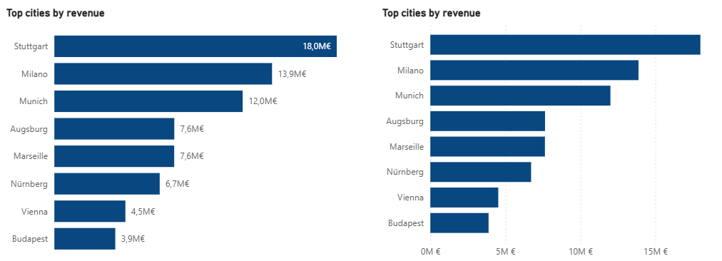
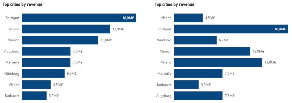
Proper sorting makes insights immediate: Ordinal data (like Low → Medium → High) should follow its inherent order. Nominal data (like product names or countries) should be sorted by the metric value, so the viewer instantly sees the largest and smallest.
Power BI defaults to alphabetical sorting, so set the order intentionally by numbering your categories.
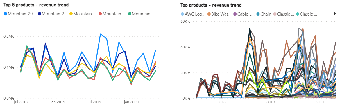
Line charts get messy fast. Keep the number of series under 6 to avoid a tangled mess. Use TOP N filters or provide a single “total” line with slicers for deeper exploration. A clear line chart beats a rainbow spaghetti chart every time.
Just because Power BI offers ribbon charts, funnels, and gauges doesn’t mean you need them all. Stick to classic, proven visuals: bar charts, line charts, scatter plots, maps, and the occasional pie, donut, or treemap. Too many chart types make dashboards look chaotic and harder to interpret.
Consistency builds familiarity, and familiarity builds efficiency.
When you need to show multiple levels (year → quarter → month → day), don’t create four separate charts. Drill-downs and hierarchies let you combine all levels into one visual. This keeps dashboards clean and interactive, letting users explore without feeling overwhelmed.
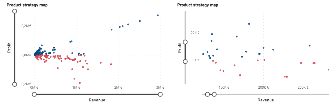
Scatter plots are underused but can reveal great insights, if handled well. Static scatter plots require labels, which limits how many points you can show, but interactive plots let users hover for details, and zoom sliders allow focus on dense clusters.
This keeps your scatter plots informative without overcrowding them.
Every formatting choice – titles, colors, gridlines, sorting, or drill-downs – might feel small in isolation. But together, these micro-decisions transform a dashboard from busy and confusing into clean and decision-ready. And that’s what separates an average dashboard that keeps you guessing from a great dashboard that shows you insight at a glance.

Understand your costs.
Focus your resources.
Pricing tier 1: Clarity

Track your goals and KPIs
with a high-level overview.
Pricing tier 2: Focus

Know what sells.
Optimize what doesn't.
Pricing tier 2: Focus